
TRON Comic Issue 2 Review (CONTAINS SPOILERS)
 While I have tried to keep them to a minimum, this article contains spoilers about the second issue of the TRON: The Ghost In the Machine comic. So if you haven't read the comic yet, you may want to stop reading this!
After a delay of four months (this issue was supposed to have been released in July), Issue #2 of TRON: The Ghost In the Machine has finally arrived. It's been a long wait between Issues #1 and #2. Let's hope people are still looking out for this comic, and haven't forgotten about it!
Issue #3 appears to be on track for December, so there shouldn't be such a huge gulf between issues this time. (Hopefully. Crossing fingers.)
Where to start. Well, first off, once again the print and material quality of this comic is outstanding. Just like the last issue. Now — I have to admit that I am not an avid comic book collector. At least, not any more. But I have collected a fair amount of comics in my time. And I can't ever recall a more beautifully done, slick-looking book. Maybe I just need to start collecting more comics. But for a small publisher, SLG Publishing sure puts out an impressively "packaged" product.
As to the contents of the issue itself? There is good and bad. The story is kept moving along at a great pace, and leaves you wanting more. Which is a good thing. But the artwork will also leave you wanting more. Which is, of course, a bad thing. I'll discuss the art a bit later.
Also like last time, the issue features a text recap that helps to bring the reader up to speed: about what happened in the last issue, and about TRON in general. (I noticed that this time it makes mention of the fact that Alan Bradley programmed TRON. ;)
Before I continue — and discuss the story and art elements — I'd just like to say that this is a dark issue. This isn't your typical Disney-approved fare. This issue deals with suffering and death, more-so than the last issue. It may be occurring in the electronic world inside the computer, but it's still strong stuff. This comic probably isn't for children. However, as a TRON fan, I personally enjoy the fact that this book is dark and adult. A Disney-fied happy, fluffy story is definitely not what I wanted to see. So thank you Landry, Eric, Louie, and the rest at SLG for giving us a serious TRON comic.
Last chance! Spoilers start here!
 Issue #2 starts exactly where we left off in Issue #1. Jet Bradley (Alan Bradley's son) is now in the computer, greeted by a female program. And right on the very first page, she de-rezzes (dies) in front of his eyes. Shot down. Wow, what a bold beginning. Depicting death in TRON like this takes balls. I'm amazed Disney let this go through. But I'm not complaining!
There was considerable speculation as to whether this female program was Lora. Lora is Jet's mother, who has unfortunately passed away since we last saw her in TRON. So, of course, seeing his mom inside the computer would have been something of a shock. But alas, it appears this was not the case. Nice work on the writers' part for making us think otherwise, though.
 After witnessing the death of the female program — who is a soldier — we come to realize that there is a war being fought inside the system. Jet finds himself caught in the middle of it, with death and destruction all around him. At first you might be led to believe that this could be some kind of simulation. In fact, I'm still not one-hundred percent sure it isn't. Even after reading the comic more than once. But for now, I'll go on the assumption that it all did actually happen.
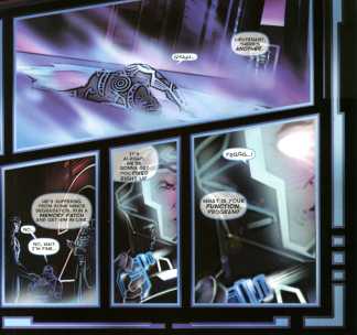 Jet is disoriented and confused from the digitization process, and the fact that he was probably wounded when the police shot at him in the last issue. Some programs help him out, and he is brought to a gigantic meeting being held. The leader of one of the factions in the war is presented on a giant screen, his face bearing down upon the gathering. This moment has a distinct Orwellian tone to it, most likely intentional. Soon, Jet discovers that the MCP has survived! Recognizers from both factions populate the sky as well, in great numbers. (I'm sure many TRON fans out there will smile with glee when they hear this.)
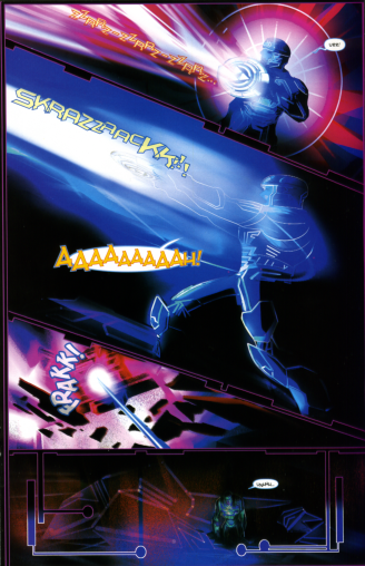 Shortly afterward, in fact, Jet unwillingly battles one of these Recognizers single-handedly without any aid, except for an identity disc. Although "injured", he survives. The other programs are astonished. He should not have survived. The leader of the faction that is fighting for the Users (the Blue programs) is alarmed about Jet. He considers him a rogue element and a possible threat to their cause. But soon he is accepted (in a very remarkable way, as you'll find out), and is asked to join. Apparently, no one knows he is a User yet, except for Mercury — who shows up and greets him. Jet knows Mercury from the story that took place in the TRON 2.0 game, and she became his friend during the time they spent together.
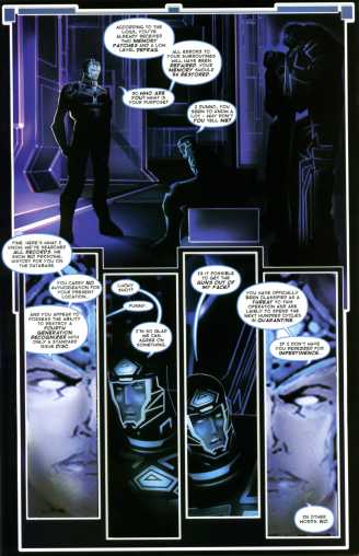 The issue ends with Jet accepting his role as a part of the Blue faction, and will attempt to help eliminate the MCP and his Red faction once and for all. But Jet is still troubled, deeply, by something he can't understand. I won't get any more specific than that, or else I will spoil the storyline too much. Let's just say that I believe the MCP knows of his existence in the system, and is setting him up for a fall.
Time to make some observations now, about the story and artwork. Let's start with the art.
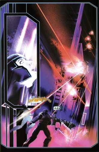
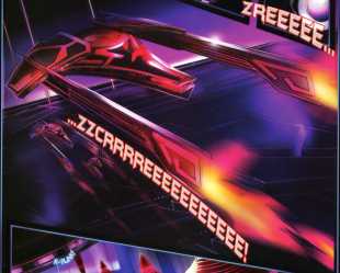
It could be argued that since Jet is confused and hazy upon entering the electronic world, maybe the art should reflect that. But I don't actually believe this was an intentional story device. I feel the art was rushed in some parts, and overall is simply not on par with the first issue. There are certain panels that are as lush and detailed as the previous issue . . . and then there are many which appear muddy, hazy, and crude. The last two pictures above, are examples I've specifically picked out to show you. The fourth image exhibits probably the worst page in the entire book. The fifth image also shows how dark and muddy the art is, at times.
As Louie De Martinis apparently will no longer be doing the artwork starting with the next issue, it seems such a shame and a disappointment that he is leaving us without producing his best work. The comparison between Issues #1 and #2 is pretty striking. Once more, that is not to say that parts of the book aren't very well done. But on the whole, it's quite uneven.
In the third image, you'll notice that some of the word balloons are partially transparent. It's pretty odd that this was not caught before the book went through to the printer. It doesn't bother me that much, but it is quite noticeable. Also, while the lettering is well done, it's a bit smaller than in the first issue. The larger text in the last issue was easier to read. But right now I'm just being overly critical, I know. ;)
On pages 4 and 5, and also on pages 17, 18, and 19 — the layout and flow of the panels is somewhat confusing. Again, I'm not sure if this is intentional or not. But I have to admit that when I first read the issue, I was somewhat put off by it. For those of you out there — when the time comes that you get your hands on Issue #2 — do yourself a favor, and read it more than once. It took more than one reading for this issue to click with me. And even then, I still find these layouts hard to follow.
Something that bothered me about the story, is how Jet joined the Blue faction. It's hard to explain what troubles me without spoiling what happened. But I guess I'll simply say it's a bit surprising, that little concern was shown when Jet took his place among the Blue faction. We never got to know the name of a certain character beyond his title, and Mercury's reaction was very matter-of-fact. I'd think a program of his stature — leaving in the way that he did — would elicit more of an emotional response. He became a part of something else, and is most likely not coming back. He should be missed, to some degree.
Spoilers end here!
Further nitpicks. Sorry, but somebody's gotta do it. ;)
- The inside-front cover lists this issue as being published April 2006.
- The inside-rear cover only mentions the TRON-Sector web site. While I fully agree that TRON-Sector should be the official site for discussion about TRON: The Ghost In The Machine, and deserves top-billing, it would have been nice to mention at least some of the other TRON sites out there too. (See sidebar on right. :)
- Once again, nowhere in the issue is it mentioned that part of this comic's story is based on the game TRON 2.0. For all the readers know, the "Hit Game" mentioned on the front cover could be referring to the arcade game. It might not be in SLG's interest to promote TRON 2.0, but it sure as hell should be Disney's. This is a prime opportunity to do some cross-promotion of TRON products, and the game is extremely relevant to the comic. Why has this opportunity been passed up again? Sigh. Disney can't market TRON to save their lives.
Final thoughts. On the whole, the story is what drives this comic and is the reason you should be purchasing it. It's definitely turning out to be an adult, lively take on the TRON universe. You'd be doing yourself a disservice not to pick it up. It's only $3.50 per issue, and the quality of the print and materials is exceptional for that price. Unfortunately, I felt the artwork and layouts were something of a mixed bag this time around. But, again, don't let that stop you from picking this up.
I look forward to the next issue, with new artists Mike Shoyket and Joe Weltjens. Hopefully TRON: The Ghost In the Machine will become more consistent now: both in terms of release dates, and artwork. I found it a bit odd that SLG's web site never paid much attention to the delays on Issue #2, while TRON fans were left to wonder what was going on. :/
November 17th UPDATE: Issue #2 is now available for purchase online from the SLG store. As of yet, Amazon.com is not offering it. Check out my review of Issue #1, where you can also find links to purchase the first issue online.

 View my complete profile
 Contact Me
there is like zero setting in this issue just characters standing in black backgrounds. And yes the story is impossible to follow. I think they left out a few pages or something. I was confused as hell. all the sudden something happed and I have no clue what. the sequencing needs to be resolved.
-Z
It will be. There is a new artist as of issue 3.
So, assuming they are intentional -- and even if they aren't -- I really like it. It's hard to visually set text into a background conversation in print, so from an artist's standpoint, I think this is a good, witty solution.
Please re-read the semi-transparent balloons like this and let us know your feelings, Redrain. I wanted to give this perspective to you.
PS: Do I have an error issue, or something? There are no page numbers on mine. Or they are hiding very well :)
-Traahn
And as for listing more Tron websites, I don't think it's really necessary. I like that the comic gets down to business without a lot of advertising or other clutter. Tron-sector is a good central hub for everything Tron. People can do their own Google searches, or click on your TronFAQ banner, etc. No need to list multiple sites and clutter things. Granted, if SLG ever wanted or needed more marketing dollars, I'd be okay with them adding a bit of advertising. Would be unfortunate, but they need to make money, too. As it is, though, I think it's fine.
Attacking this wording again: "Inspired by the hit video game" is a bit unwarranted. It's simple, concise verbiage. Anyone who is new to Tron can do their own research. I don't think it's right to spoon-feed everything to eveyrone. People like mystery sometimes. I undestand your plight of wanting to cross-sell everything related to Tron in these comicbook issues, but I personally don't want that. Just difference of opinions, I suppose.
-Traahn
The problem is, many people won't even think to look if they don't know these things exist. Out of sight, out of mind. My own experience - e-mails from fans over the years - has proven this.
An example right here: http://tronfaq.blogspot.com/2006/02/typical-e-mail-received-by-tronfaq.html
And there is no excuse for Disney not taking this opportunity to cross-promote the comic with other Tron merchandise. A one page ad in the comic for something like the Disney Online store, and their collection of Tron items available, is not going to kill anyone. It's just poor planning and organization on Disney's part.
And a couple more quick comments: I think the font size is fine.
The lettering is nicely done, but I preferred the slightly larger text in the previous issue. My eyesight isn't poor, but I had an easier time reading the balloons in issue #1.
I feel the artist was trying to set those conversations into the background. (You know --> background vs. foreground conversations. The semi-transparent ones are kind've like background chatter in a movie.
I came to that realization shortly after I wrote the review. But I decided that instead of retracting what I had written, I would follow up on it. Which I'm now doing. :)
What kind of made me think differently at first (i.e. it was a mistake), is that only a few balloons are translucent. It wasn't used consistently throughout the entire issue. If there had been translucent balloons throughout the issue, I never would have come to my earlier conclusion.
You make some good points, and I realize now that it was intentional.
Alternate artwork pages